Wednesday, June 29, 2011

A Make It Crafty Scene

     I guess this is more of a picture than a card although it's mounted as one.  I couldn't get the photo to show that the card base is actually a deep purple although it looks black.  Make It Colourful is primarily a coloring contest and by the time I finished creating the scene, there wasn't much room for extra frou frou's anyway.  So . . . it's pretty plain and simple--NOT!  LOL
     This is another entry for Zoe's challenges over at Make It Colourful.  I think this one fits a couple of the challenges, but I made it mainly for the "combine as many digi mages as possible" one.  There are six different digital stamp images merged together to make this scene, plus I used part of the fence and some of the rocks and plants from the bench image to finish the scene.  I've included a photo of the scene without the cute little Jane sitting on the bench so you can see the rest of the fence behind the bench.  She's popped up with pop dots.
     The entire scene is colored with Copics.  This was definitely a major project!  Merging photos in Photoshop is really easy, but doing that many and having to use the erase tool in all those little spots had my hand doing some major cramping.  I like the scene though.  I just wish I could have done it better justice with the coloring.  I'm not sure if I like the way I colored the ground or not, but I'm definitely not happy with her hair.  Hair is so hard for me.  I guess I'm going to have to print myself a bunch of heads and just practice.  LOL
     Mainly this was just a huge challenge to myself in a lot of areas and I can certainly use the practice.
     Thanks to all my friends for all the wonderful birthday wishes.  It has definitely been a kick back, relax and play day for me.  Just what I needed.
     Hugs to you all!


Supplies

Papers:  Bazzill, X-press It Copic Blending card
Stamps:  Make It Crafty "Tree of Love", "Crooked Picket Fence", "Daffodil Dell", "Park Bench for Two", "Sitting Jane", and "Wild Flowers"
Copics
           tree:  E21, E31, E47, E50, G40, G82, G94
           flowers: Y02, Y32, Y35YR61, YR65, YR68, R24, R29, R30, R32, R81,
                       R83, R85, BV13, V12, V17, G85, G94, BG93, BG96, YG67, YG93
           mushrooms: E41, E43
           fence: W1, W3
           bench: E71, E74, E79, C0, C2, C6
           ground:  E41, E43, E50, E51, E53
           sky: B000, B91, C0
           skin: E000, E00, E11, E13, R20
           hair:  E50, E53, E57
           clothing:  V12, V15, V17, V, 93, V95, BV000
A Vellum Tutorial for The Kraft Journal

     It's my turn to bring a tutorial for The Kraft Journal this week and I decided to show you a quick and easy way to use vellum for your cards.
     For this tutorial I have used some Translucent vellum and some Kraft Blank Note Cards from Kraft Outlet.  This is cardstock vellum (28 pound weight) so it's a bit thicker than what you usually find in the stores and it's really wonderful to work with.
     I also used some stamps, Versamark, opaque white embossing powder, an embossing buddy, a heat gun, some Copic Markers, and a two-way glue pen.

      First I stamped my flower image in Versamark and embossed it on a piece of the vellum cut slightly smaller than the note card.  I also stamped the sentiment.
      Next I made a mask for the flower and added the leaves.
     After everything was embossed with the heat gun, I turned the image over and used Copic markers to color the images.  You could also use chalks or even alcohol ink.  If you use the alcohol ink though, ink your vellum before you stamp and stamp on top of it.  If you try inking afterward you'll either cover your white embossing with the ink or you'll have to ink on the back of the image and it just doesn't show very well through the vellum.
     Here's a view of the finished vellum piece by itself on top of the note card.

     And here's what it looks like with some white card stock behind the vellum. It really makes the colors pop.

      I mainly wanted to show you the technique so you could embellish this in so many different way--pearls, pretty ribbons, etc.  In keeping with our possibly wedding themed challenge, you could really make some cute thank you cards for all those wedding gifts or maybe just a few special ones if you throw a big shindig.  :-)
     Happy crafting!

Tuesday, June 28, 2011

Papercraft Star Challenge #51

     Working pink into a masculine card for this weeks challenge at Papercraft Star was not easy, but if you look really closely at the trout he has a pretty pink stripe running down his side.  LOL
     The card base is gray Bazzill.  I cut a white mat and used my Martha Stewart scorboard to emboss some lines into the paper for added interest.  Some Bakers Twine and buttons and one of Tradefish Designs "Missing You" sentiments complete the card.
     Get your submissions linked up by 9:00 p.m. Est on Sunday.
     Happy Wednesday!


Supplies

Papers:  Bazzill, Georgia Pacific
Stamp:  Tradefish Designs "Missing You"; image from internet
Tools:  Martha Stewart Score Board
Miscellaneous:  Crafter's Square hemp cord, Bakers Twine, buttons from my stash

Thinkin' of You

     Yes, I am still alive.  LOL    I'm telling you, I've either totally lost my housekeeping abilities or that vacation relaxed me a little TOO much.  HA! HA!  I finally got my house caught up yesterday so I was able to play a little and make a for fun card. 

     Make It Colourful is one of my favorite places to play because it's helping me hone my coloring skills, plus it's amazing creator, Zoe also owns Make it Crafty, which features some of the most fun and wonderful digital and rubber stamp images.  Make It Crafty is celebrating its 1 Year Anniversary and Zoe has some great challenges going on, not to mention an UNREAL blog candy giveaway.  Also today is the last day to get in on a great 40% off sale on all those fun MIC digi images.  I definitely took advantage of that sale so you'll be seeing lots of MIC images on my cards soon.
     There are five challenges and this card was made with the fifth one in mind--to color the image using the Make It Crafty blog colors (blue, brown and mustard yellow).  I've combined "Whimsical Log" and "Sitting Annalise" in Photoshop for this card.  The image is done in Copics except for the yellow chalked background.  That cute little decorative corner is also a MIC product.  It's laser-cut chipboard and the fine detail is just mind blowing.
     I'd like to enter this card in the following challenges:

Make It Colorful--use MIC blog colors
Stamps R Us--there was a little girl
Phindy's Place--going around in circles

     Before I sign off I just wanted to share the lovely birthday gift I got from my sweet friend Ira.  She sent me some awesome goodies to play with and a beautiful bracelet.  Thanks again Ira!

     Yep, tomorrow will mark another year that's passed in the life that God has blessed me with.  He has been so good to me.  I have so much to be thankful for and one of those things is that I got to share this last year of my life with all my bloggie buddies here on the net.  I'm looking forward to sharing another one with you all and can't wait to see where all of our crafting journeys will lead.  MWAH to you all!
     Off to check on the pot of gumbo I'm cooking for my dad (he had knee replacement surgery last week), finish up a DT project, start a couple more, and who knows what else.  LOL
     Have a wonderful and blessed day!


Supplies

Papers:  October Afternoon, Bo Bunny, Georgia Pacific, X-press It Copic Blending Card
Stamps:   Make It Crafty "Whimsical Log" and "Sitting Annalise"
Ink:  Copics--WAY too many to name  :-)
Tools:  Nestabilities Standard Circles Large (S4-114), Martha Stewart Frond punch, sewing machine
Miscellaneous:  Make It Crafty Laser-Cut Swirly Corner Chipboard piece, Polymark Dimensional Fabric paint, Studio 112 pearls, Inkadinkado Blending Chalks, Prima and Recollections paper flowers, Hug Snug Seam Binding, Candlelight Glimmer mist

Monday, June 20, 2011

The Kraft Journal Challenge #24

     June 21st is the first official day of summer. It's also my dad's birthday.
     I've had this image in my files for a long time, but when I saw this week's challenge at The Kraft Journal I knew I had to print it out for my DT card. Summer and barbecue--oh yeah! My daughter would definitely want to kiss this cook with that juicy steak on his fork.
     He's actually my second go at this image. The first one was done in more red, white, and blue colors, but when I saw this We R Memory Keepers paper in my stash I just had to use it. So . . . cook got recolored. {grin}  I also ran the top piece of red through an embossing folder and sanded it a little.
     The little star banner was created using stars I cut out of chipboard and covered in some of the paper. They're strung on some Red Baker's Twine.

     For the inside of the card I covered a Card Sleeve Envelope with some of the paper and wrapped some the the Bakers Twine around it.  Before I covered the sleeve I used my sewing machine to sew across the sleeve since it's deeper that the tag.  The tag is a Scalloped Grungy Prim Tag.  I used a little mini stamp set to stamp the cook out details and stapled a piece of Natural Twill Tape to the tag.
     So what reminds you of summer?  Get your entries linked up by 6:00 p.m. EST Sunday for your chance at this months $15.00 store voucher to the Kraft Outlet.
     I'd like to enter this card into the following challenges:

Creative Inspirations paint--bright colors
Sentimental Sundays--summery or sparkly
Crazy 4 Challenges--add twine, floss or string
Just Some Lines--spotty/dotty
Aud Sentiments--summertime
Do You Stack Up--use a star
Alota Rubber Stamps--summertime
Always Something Creative--summertime
Crafters Companion--here comes summer
Crafting for All Seasons--summer
Little Darlings--summer theme

     Happy Monday!


Kraft Outlet Supplies

Precut Chipboard Full Sheet
Red Baker's Twine
 Card Sleeve Envelope
Scalloped Grungy prim Tag
Natural Twill Tape

Supplies

Papers:  We R Memory Keepers, Georgia Pacific, Copic Express-it Blending Card
Stamp:  Just Inklined "Kiss the Cook", We R Memory Keepers "Time"
Ink:  Shabby Shutters Distress ink, Versafine Vintage Sepia, Sakura Sepia Micron Pigment pen
Copics
            skin E000, E00, E13
            hair E31, E35, YR20
            hat and apron W1, W3
            clothing B91, B93, B95, B97, YG11, YG17, E53, E57
            tongs N1, N3, N5, N7
            meats E07, E08, E97, R24, R27, R29, E41
            grill YR65, YR68, N1, N3, N5, N7
Tools:  Nestabilities Large Deckled Rectangles (S4-202), Sizzix Stars #2 die, Cuttlebug Embossing folder Spots and Dots
Miscellaneous:  Offray ribbon, Yellow Stickles

Friday, June 17, 2011

Beary Sweet


     This is a simple little card I made for the challenge at Phindy's Place.  Isn't it a sweet image!  The image is colored with Copics.  I REALLY missed my markers while I was on vacation.  LOL
     This is my second post of the day so scroll down to see little Rapunzel if you missed her.
     I'd like to enter this card into the following challenges:

Phindy's Place--black and white except for the image
Crafts 4 Eternity--use embellishments starting with "R" (ribbon and rhinestones)
Sweet Stamps--embossing
Forever Friends--spots and dots, must include an animal

Happy Friday!


Supplies

Papers:  Recollections, X-Press It Copic Blending Card
Stamp:  Phindy's Place "Beary Beautiful", Hampton Art grid stamp
Ink:  Memento Tuxedo Black ink
Copics:
            bears E41, E43, E47, R30
            dress R81, R83, R85
            flowers Y08
            buggy  RV10, RV21, RV23, N1, N3, N5, N7, BV29
            shadowing W1, W3
Tools:  Nestabilities Labels Sixteen (S4-301), Memory Makers eyelet setter, EK Success Retro Flower punch and Scalloped Scallop border punch, Martha Stewart Frond punch, Cuttlebug, Spots and Dots embossing folder
Miscellaneous:  Offray Ribbon, Recollections eyelets, The Paper Studio pearls, Michaels $1 bin rhinestones, Inkadinkado Blending Chalks

Little Rapunzel

     I think I need a vacation from my vacation.  LOL  I'm having a hard time getting back into the old routine, but I've squeezed in a little crafting time in between trying to get my house back in order and running smoothly.  This is an image from one of Tammy Thompson's A Day for Daisies newest Fairy Tale collections, Rapunzel.
     Rapunzel and her little friend were colored with Copics.  I added some eyelets and threaded some hemp cording and beads through them.  Lots of ribbons to match her hair too.
     I'd like to enter this card into the following challenges:

Southern Girls--anything goes
Bearly Mine--anything goes
Top Tip Tuesday--open challenge

     Have a wonderful weekend!


Supplies


Papers:  My Mind's Eye, Bazzill, Copic X-Press It blending Card, Recollections
Stamp:  A Day For Daisies "Time in My Tower", Papertrey Ink "Friends"
Ink;  Versafine Vintage Sepia
Copics:
           skin E000, E00, E11, R20
           hair E31, E35, YR20
           clothing R22, R24, R27
           chair E53, E57, G82, G94
           brush E47, YR31
           shading E53
Tools:  Bow Easy, sewing machine, Making Memories eyelet setter
Miscellaneous:  ribbon and beads from my stash, Making Memories eyelets, Jewel Tone Hemp Cord from Kraft Outlet, Jolee's pearls

Tuesday, June 14, 2011

Papercraft Star Challenge #50

     It's week number three of our dual challenges at Papercraft Star.  This weeks challenge is to make a creation using elements that start with the letters of the word STAR.  I have to admit it took me a little while to come up with the combination I used.
     The focal point of my card is the stamped image of the bird which I have matted onto a Scallop die cut.  Beneath the image I've used some fun Trim.  The base of my card is kraft cardstock.  The first mat is chocolate brown and the second was created with Alcohol ink.  Lastly I added some matching Rhinestones.
     Cecilia is offering another set of TradeFish Designs stamps for this weeks prize  and our Grand Prize sponsor for the month of June is The Scrapbooking Cottage.  Each time you play your name will go into the drawing at the end of the month for the Grand prize.  Our link will be open until 9:00 p.m. EST on Sunday.
     Happy Wednesday!


Supplies


Paper: Ranger Gloss Paper, Bazzill, Recollections
Stamps:  TradeFish Designs "Missing You", Tim Holtz "Urban Grunge"
Inks:  Rust, Caramel, Latte, and Gold Alcohol inks
Tools:  Nestabilities Labels Eight (S5-019), Classic Scalloped Ovals (S4-111), and Classic Ovals Large (S4-110)
Miscellaneous:  Stampendous Jeweled Gold Transparent embossing powder, Versamark, Timber Brown Stazon, acrylic rhinestones, trim from my stash

I'm Back!!!!!!!!!

     WOW!  What an awesome vacation!  I just have to share a few of the things we saw.  These may be no big deal to some of you {like my Canadian friend Nancy who probably sees this a LOT :-)}, but to this sea level low lander it was AMAZING!  Plus I never expected to see all the snow that was still lingering.  Huge climate change from 100+ to 30-40 degrees.  Now I have to re-adjust and this way is much harder.  :-)
     We stopped long enough in St. Louis to see the arch.  I honestly thought it was about a third of its actual size.  It's HUGE!!

Onward north to South Dakota to see the Badlands and Mt. Rushmore.


The way this monument was built is just incredible.  Those men were some brave souls!

The main event--YELLOWSTONE!

Yellowstone Lake is about 20 miles long and 430 feet at its deepest point.  I was just awed at the amount of it that was covered in ice, and the view across it to the mountains is so beautiful.

Old Faithful!

Next stop, the Grand Tetons.

Here are just a few of the fun critters we saw along the way.
This buffalo must be VERY important.  It's the only one we saw with a tracking collar.  Hard to believe that cute little guy grows up into its companion.  LOL
I think this little guy is a marmot.
A little lady Bighorn sheep.

     These are just a few of the digital pics I took.  I still have NINE rolls of 35mm film to develop!  LOL
     I've missed all you guys and will be making my way around to visiting you all ASAP. 

Monday, June 13, 2011

The Kraft Journal Challenge #23


     It's a "Father's Day" challenge this week at The Kraft Journal.  My image is from Meljen's Designs and is colored with Copic markers.  Sure hope those are plastic worms in his pocket. {grin}
     The card base is made from Brown Kraft Cover Weight cardstock.  I stuck a Small Kraft Shipping Tag in behind the image with a piece of Natural Twill Tape for the pull.  A length of Earthy Hemp Cord is wrapped around the card and strung through the button and the sentiment frame was stamped with a 7 Gypsies ATC Label rubber stamp.
     Here's what the tag looks like.

     Remember, each time you enter our challenge you get a chance at winning a $15.00 store voucher to the Kraft outlet.  Get your submission linked up by 6:00 p.m. EST on Sunday.
     Happy Monday!


Kraft Outlet Supplies


Brown Kraft Cover Weight Cardstock
Small Kraft Shipping Tag
Natural Twill Tape
ATC Label Rubber Stamp
Earthy Hemp Cord


Other Supplies


Papers: Bazzill, Recollections, Copic Express-it Blending card
Stamp:  meljen's Designs "Fisher Moose"
Ink:  Walnut Stain Distress ink, Sakura Sepia Micron pigment pen, Inkadinkado Blending Chalks, Memento Tuxedo Black
Copics
            moose E02, E41, E43, E47
            clothing YG93, E40, E43, E47,
            fishing pole Y17, Y21, R29, C0, C2, C4, C8
            fish G82, YG93, B02
            worms B000, B02, Y17, Y21, E97, E08
Tools:  Tim Holtz Tiny Attacher
Miscellaneous:  American Crafts button, Crystal Stickles

Tuesday, June 7, 2011

Papercraft Star Challenge #49

     This is our second June challenge at Papercraft Star and don't forget we're being sponsored ALL month long by our former Design Team member, Cecilia Stephens.  Cecilia has come out with her own line of stamps called TradeFish Designs.

I established TradeFish Designs (aka “TFD”) in April 2011 in Raleigh, North Carolina. TFD was created because I felt there was a need for stamps sets I could use in cards, scrapbook pages and other crafty projects for the boys and men in my life. TFD is devoted to creating stamps with masculine themes, imagery and sentiments. You can use the images and sentiments for feminine cards or projects too, but the focus in my design work is really about the boys. I promise that there will be no flowers, butterflies and/or girly swirls in any TFD sets. All the designs are a product of my own quirky design style and sense of humor, as well as a reflection of the boys and men I have been privileged to know and love. I hope you enjoy TFD stamps and create wonderful projects for the people you care about.


     This months challenges are dual.  Besides the regular challenge, we're also challenging you to make your project masculine.  You can use the regular challenge idea, combine it with the masucline twist or make one of each!
     For my DT Card, I've used some DCWV Metallic paper.  The panels were created with alcohol ink on Glossy Paper.  For the image I stamped with Distress ink using the Versamark trick.  The star is a chipboard star cut with a Sizzix die that I covered twice with silver embossing powder and stamped on while still wet.
     Let us see what you can do with this challenge and get it linked up by 9:00 p.m. EST on Sunday for your chance at a set of stamps from TradeFish this week and a chance at this months Grand Prize from The Scrapbooking Cottage
     Happy Wednesday!


Supplies

Papers:  DCWV, Ranger Glossy Paper, Georgia Pacific
Stamps:  Studio 112, Inkadinkado, and Tradefish Designs "Missing You"
Inks:  Broken China and Shabby Shutters Distress ink
Tools:  Nestabilities Standard Circles Large (S4-114), Sizzix Stars #2 die and Cuttlebug
Miscellaneous:  Ranger Silver embossing powder, Recollections brads, Kraft Outlet Green Bakers Twine

Monday, June 6, 2011

The Kraft Outlet Challenge #22

     It's a Guy Thing challenge this week at The Kraft Journal.
     Speaking of guy things--recently my husband came home and shared something he heard on the radio driving home from work.  He was rather pleased with what he was going to tell me because he felt it summed things up pretty darned well (in defense of men of course) and I have to agree that the people who came up with this may very well have hit the nail on the head.
     Apparently a man and wife couple have written a book called "Men Are Like Waffles--Women Are Like Spaghetti".  The premise is that when women think, everything we think is all tied together like long strands of spaghetti.  We are constantly looking at future outcome and how things effect other things.  Apparently men aren't capable of this.  Their thoughts are all compartmentalized like the little squares in a waffle.  To move them on to another thought you have to actually get them out of whatever waffle hole their in at the time.  LOL  This makes perfect sense and goes a long way to explain why we can't get them to think like we do. {grin}
     Okay, on to the card.  I've been wanting to play some more with the Prismacolor pencil on kraft technique.  I kept thinking about how smooth the Kraft Outlet Brown Kraft Cover Weight cardstock is and wondering how it would work with the blending process.  The answer is WONDERFUL!  The pencils blended like a dream!  The only thing I would change on the coloring is the face.  The lighter pencil colors tend to cover up the image outline and I didn't care for that.  I'll either have to improve on technique there or use Copics for the skin on future attempts.
  Since Charlie was a huge Silent Film star I wanted to keep him in "film" so to speak so I created a little piece of film strip to house his image.  I did such a good job (sarcasm intended) of photographing this card that you can't see the piece of crafting plastic I placed over the image.  (Thanks Jan!)
     To embellish the card I added some Earthy Hemp Cord and a button around the bottom decorative panel.  I created two tabs with brads from black Twill Tying Tape.  The sentiment was created on the computer and then I used the ATC Label rubberstamp to frame it.  A Scalloped Grungy Prim Tag compliments the sentiment.
  So let's see what you can come up with for our waffle, I mean guy theme for this week. {grin}  Don't forget to get your project linked up by 6:00 p.m. Sunday.  Every time you enter you go into the drawing for the monthly $15.00 store voucher for Kraft Outlet.

P.S.  Remember me.  I'm on a two week vacation with my waffle.  LOL


Kraft Outlet Supplies


Brown Kraft Cover Weight cardstock
Black Natural Twill Tying Tape
ATC Label Rubber Stamp
Scalloped Grungy Prim Tag
Earthy Hemp Cord


Other Supplies


Paper:  Recollections, The Paper Studio
Stamp:  Mo's Digital Pencil "The Tramp"
Ink:  Prismacolor pencils, Gemini Masterpeice Odorless Mineral Spirits
Tools:  EK Success corner rounder
Miscellaneous:  button from my stash, Recollections brads, crafting plastic

Wednesday, June 1, 2011

Mulberry Paper Background Tutorial for The Kraft Journal

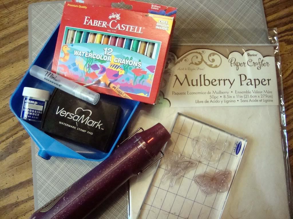
     Hi everyone!  I've got a tutorial for you this week on how to make your own background paper using mulberry paper.  Babette is now carrying this wonderful pack of Mulberry Paper in the Kraft Outlet store.  It has several different colors in the pack, but for today we're going to use a sheet of the white.

     You'll need:  mulberry paper, your choice of stamps for the background pattern, Versamark, clear embossing powder, a heat gun, a water mister, and your choice of colorant.  For mine, I've chosen to use watercolor crayons.  I've seen lots of variations on this and you can use alcohol inks and dyes also.  I tried the alcohol ink and couldn't get the softness I wanted so I went with the crayons.
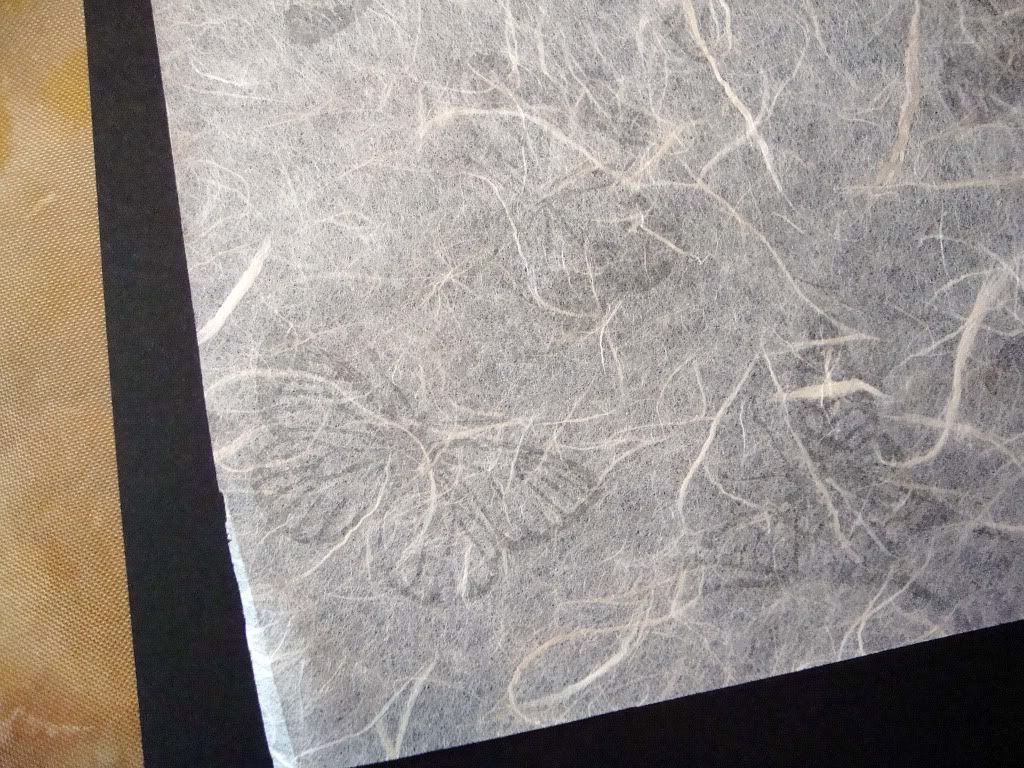
     I cut a sheet of the mulberry paper in half and used Versamark to ink up some Martha Stewart butterfly clear stamps.  I randomly stamped them all over the mulberry paper.
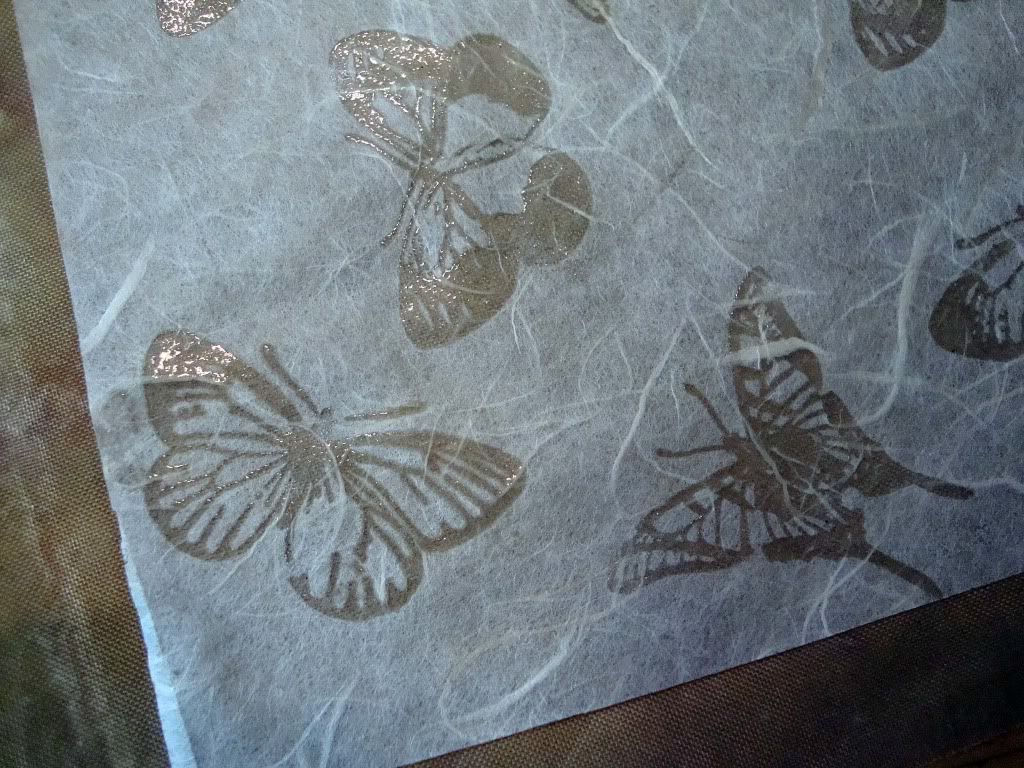
     The next step is to sprinkle the clear embossing powder over the stamped images and heat with your heat gun.
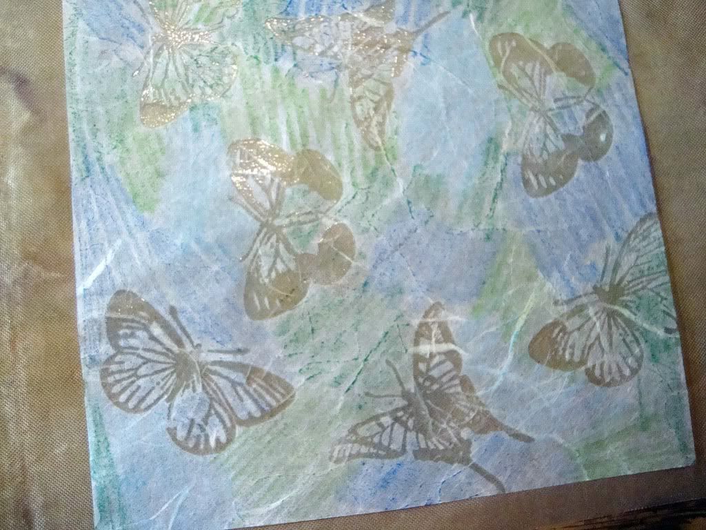
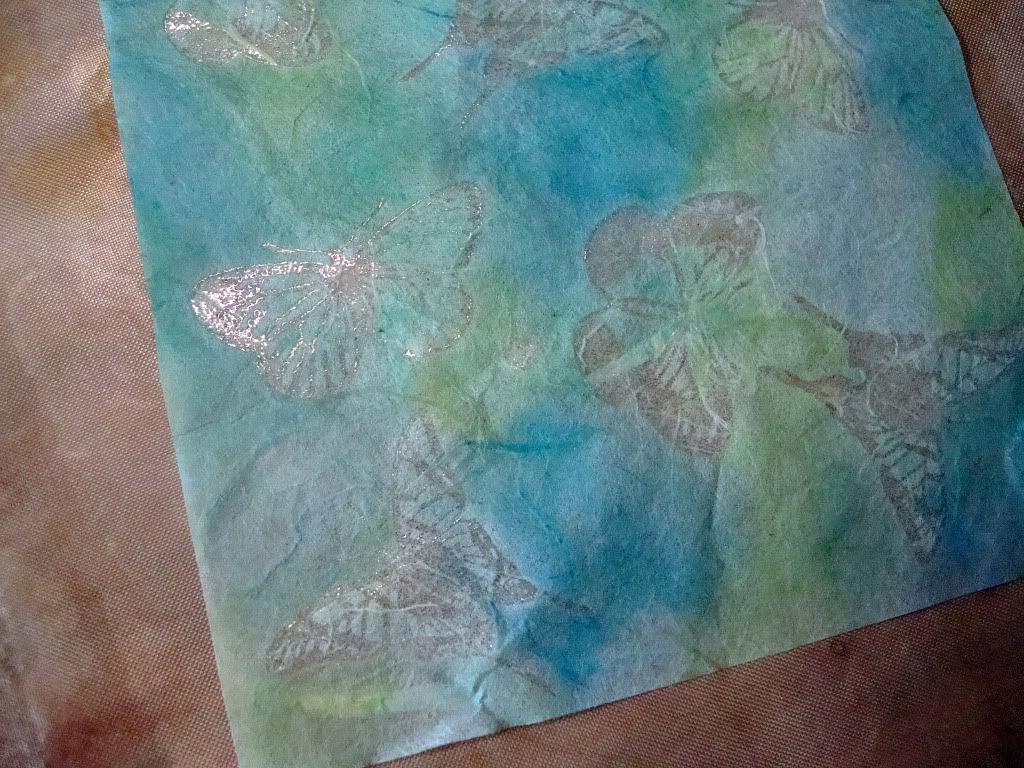
     After your embossing has cooled, use your coloring medium.  I chose two shades each of  blue and green and randomly colored all over the mulberry paper.
     Next I generously misted the paper with water.  The color starts to bleed, but I found that some light tapping with my fingers helped to get rid of all the harsh color lines.  BE CAREFUL!  The paper will tear if you're too rough.
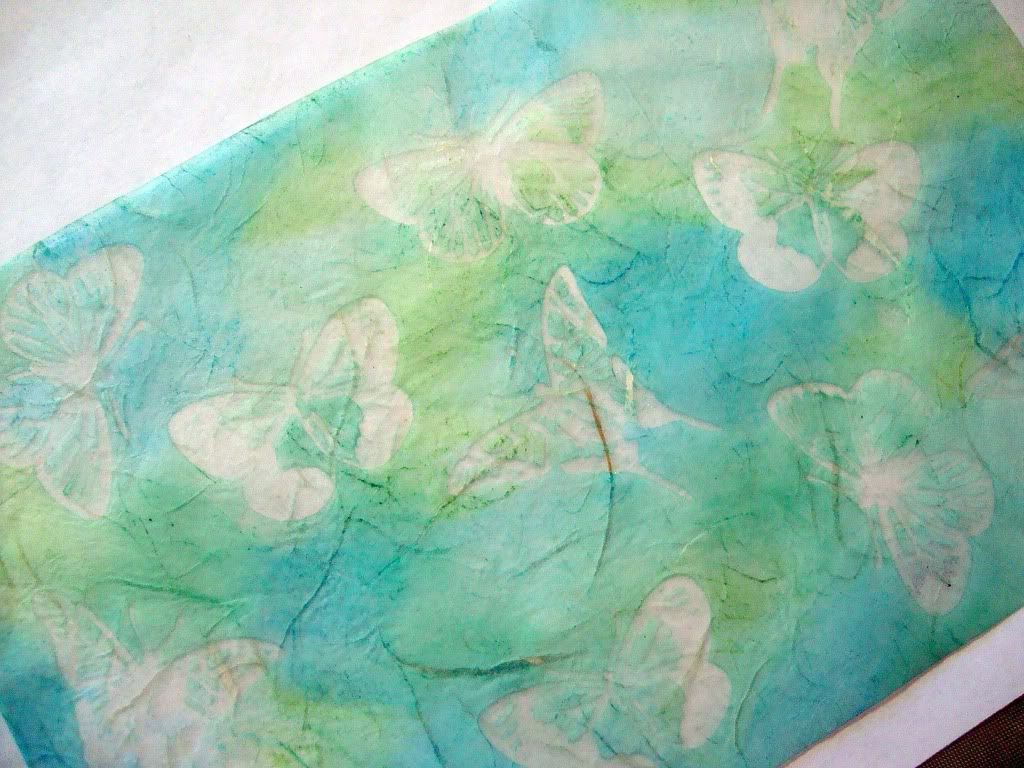
     I dried the paper until is was almost completely dry with the heat gun.  You then want to take two sheets of regular copy paper and sandwich the mulberry sheet in between.  Using you household iron on a NON steam setting, iron over the sandwich.  This step transfers the embossing from the mulberry to the copy paper leaving a clean image with no shine on the mulberry paper.  You may have to go over areas a couple of times to get all the embossing to release so you can peel the mulberry paper off easily.  You're left with the beautiful batik style pattern you see above.
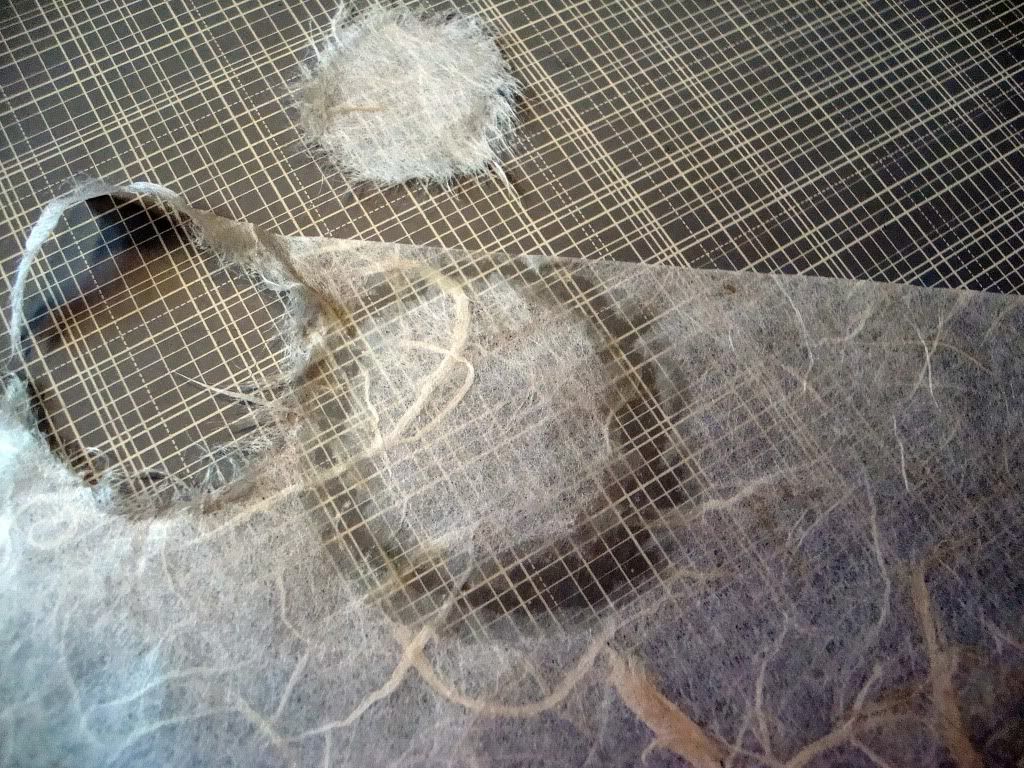
     Mulberry paper is very easy to work with and will make fun "fuzzy" flowers.  The rule of thumb with mulberry paper is that it is meant to be torn NOT cut.  Use an aqua painter or wetted Q-tip to trace whatever shape you want and then gently tear, pulling outward.  That leaves you with a nice fuzzy edge.  I tore several circle sizes lollipop style to create the fun fuzzy flower on the card below.
     Popping your batik print on top of white cardstock really helps the pattern pop out.
     Hope you give mulberry paper a try.  It's fun to work with!
     Have a great week!